>soren hale — frontend developer
// Writing
What a design system is actually for
It is not for consistency. It is for making the right thing the easy thing.
- to read
- 2 min
- published
- 2026-08-27
- filed under
- Tooling
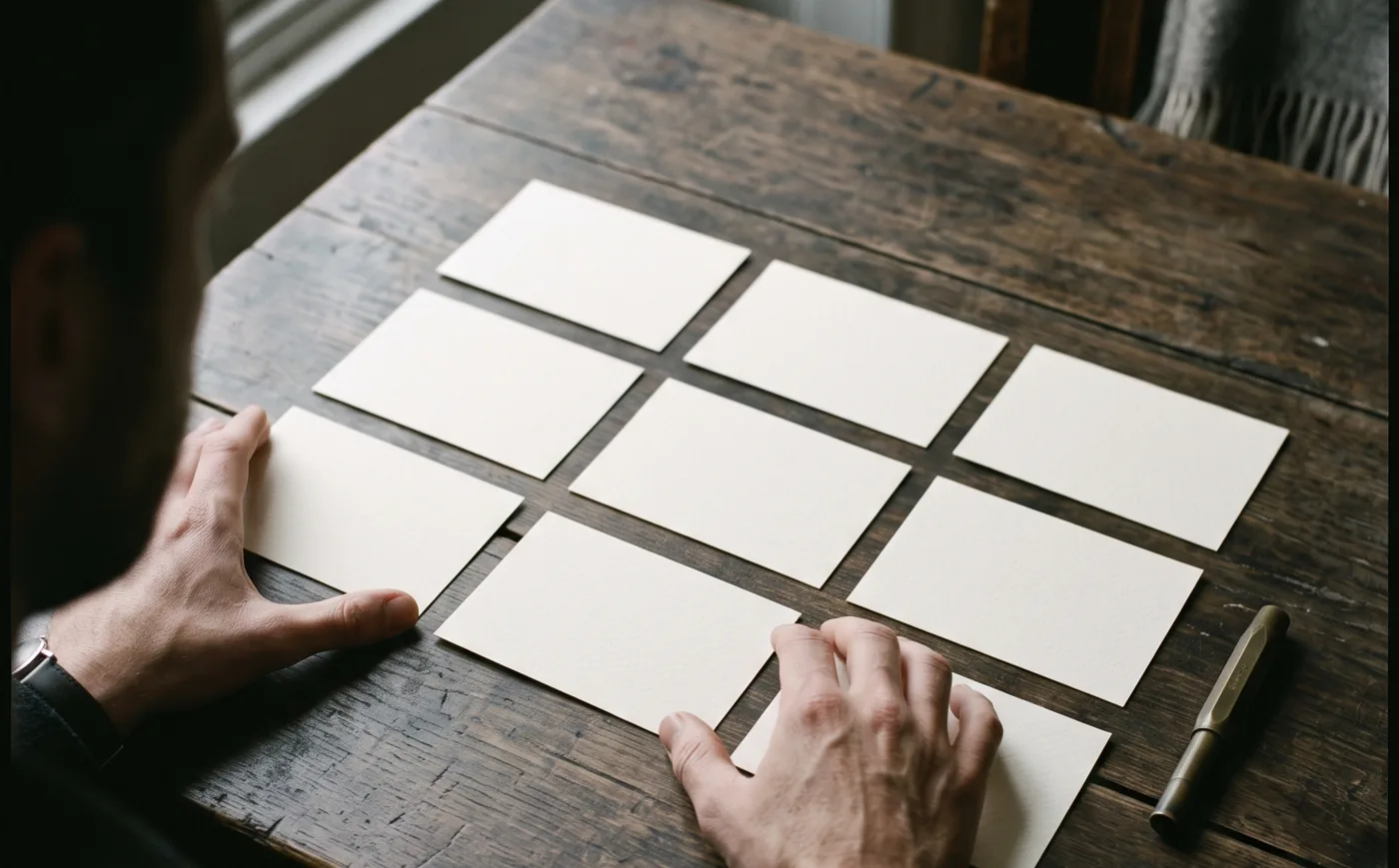
Every design system pitch starts with a slide of fourteen slightly different buttons. Consistency is the symptom people can see, so it is the one that gets funded.
The real job is quieter. A developer on a deadline should reach for the accessible, tested, on-brand component because it is the fastest option they have. If the system is slower than writing a div, the div wins, and no amount of governance changes that.
Three tests I use
- Can a new developer build a settings page on day two without asking anyone?
- When the brand colour changes, is it one pull request?
- Does the system say no clearly, with a reason?
If the answer to all three is yes, the fourteen buttons take care of themselves.
Make the right thing the short thing
Most of the work is in the types. A component that cannot be given a wrong combination of props needs no documentation for that combination.
type ButtonProps =
  | { kind: "solid"; icon?: "arrow" }
  | { kind: "ghost"; icon?: "arrow" | "down" }
  | { kind: "quiet"; icon?: never }

export function Button(props: ButtonProps & { label: string }) {
  // three looks, and no fourth one to argue about
}
At Halden the token file is the single source. Colour, type and spacing are generated for the web, for the apps and for the design library from that one file. Nobody copies a hex value, so nobody copies the wrong one.
Adoption is the product
I spend as much time with the teams as on the components: the first two screens are migrated together, and there is a weekly hour where anyone can bring a case the system does not cover. Half of those cases become a component. The other half become a written no.
A system is finished when people stop mentioning it. That took about nine months.
// Writing
What a design system is actually for
It is not for consistency. It is for making the right thing the easy thing.
- to read
- 2 min
- published
- 2026-08-27
- filed under
- Tooling
Every design system pitch starts with a slide of fourteen slightly different buttons. Consistency is the symptom people can see, so it is the one that gets funded.
The real job is quieter. A developer on a deadline should reach for the accessible, tested, on-brand component because it is the fastest option they have. If the system is slower than writing a div, the div wins, and no amount of governance changes that.
Three tests I use
- Can a new developer build a settings page on day two without asking anyone?
- When the brand colour changes, is it one pull request?
- Does the system say no clearly, with a reason?
If the answer to all three is yes, the fourteen buttons take care of themselves.
Make the right thing the short thing
Most of the work is in the types. A component that cannot be given a wrong combination of props needs no documentation for that combination.
type ButtonProps =
  | { kind: "solid"; icon?: "arrow" }
  | { kind: "ghost"; icon?: "arrow" | "down" }
  | { kind: "quiet"; icon?: never }

export function Button(props: ButtonProps & { label: string }) {
  // three looks, and no fourth one to argue about
}
At Halden the token file is the single source. Colour, type and spacing are generated for the web, for the apps and for the design library from that one file. Nobody copies a hex value, so nobody copies the wrong one.
Adoption is the product
I spend as much time with the teams as on the components: the first two screens are migrated together, and there is a weekly hour where anyone can bring a case the system does not cover. Half of those cases become a component. The other half become a written no.
A system is finished when people stop mentioning it. That took about nine months.
// Writing
What a design system is actually for
It is not for consistency. It is for making the right thing the easy thing.
- to read
- 2 min
- published
- 2026-08-27
- filed under
- Tooling
Every design system pitch starts with a slide of fourteen slightly different buttons. Consistency is the symptom people can see, so it is the one that gets funded.
The real job is quieter. A developer on a deadline should reach for the accessible, tested, on-brand component because it is the fastest option they have. If the system is slower than writing a div, the div wins, and no amount of governance changes that.
Three tests I use
- Can a new developer build a settings page on day two without asking anyone?
- When the brand colour changes, is it one pull request?
- Does the system say no clearly, with a reason?
If the answer to all three is yes, the fourteen buttons take care of themselves.
Make the right thing the short thing
Most of the work is in the types. A component that cannot be given a wrong combination of props needs no documentation for that combination.
type ButtonProps =
  | { kind: "solid"; icon?: "arrow" }
  | { kind: "ghost"; icon?: "arrow" | "down" }
  | { kind: "quiet"; icon?: never }

export function Button(props: ButtonProps & { label: string }) {
  // three looks, and no fourth one to argue about
}
At Halden the token file is the single source. Colour, type and spacing are generated for the web, for the apps and for the design library from that one file. Nobody copies a hex value, so nobody copies the wrong one.
Adoption is the product
I spend as much time with the teams as on the components: the first two screens are migrated together, and there is a weekly hour where anyone can bring a case the system does not cover. Half of those cases become a component. The other half become a written no.
A system is finished when people stop mentioning it. That took about nine months.
// Start a project
Tell me what you are building.
Three quick picks so the first reply is useful. You finish the message on the contact page.
// Start a project
Tell me what you are building.
Three quick picks so the first reply is useful. You finish the message on the contact page.
// Start a project
Tell me what you are building.
Three quick picks so the first reply is useful. You finish the message on the contact page.